I just wrapped my Candychrome art show opening and I’ve been writing down the steps I went through to get ready. The first two parts of this series dealt with the venue, the timeline and the theme of the art show. Now since I have the theme established it’s time to get started on promotion.
Flyers
 I like to design flyers as the first piece of promotion. There are several reasons that I want to do this first.
1. Designing a flyer forces you to get all of your basic information together.
2. The flyer can be used both online and in Meatspace (the real world).
3. It’s relatively simple to put together.
4. It will set the look for everything else that follows.
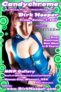
In the last part of this series I picked a 70’s poster theme for my show. I wanted something that matched the title of the show (Candychrome) and would be fun and inviting. I did some research through Google and picked some images of 70’s inspired posters that I thought fit with my theme. Color was a big part of these posters, as well as funky graphics and wild fonts.
I do all of my own design, but that’s definitely not a good idea for everyone. I’ve designed books, magazine articles, CD covers, comics and tons of flyers, so I feel fairly confident in my abilities. A professional designer might do a better job, but I’m a control freak and I can put the savings into materials. I would suggest that most people hire someone through freelance.com or other freelance services to do a professional job. It could be the best money you spend throughout this process. If your flyers don’t look good it could hurt your whole show.
I posted my flyer for Candychrome above, so you can decide if I should have hired a professional.
Elements of an Effective Flyer
I’ve seen people cram flyers full of information and I’ve seen flyers that just have one contact point. I tend to think less is more with a flyer. Most flyers will be fairly small (a standard size is 4”x6”), so you want it to be easy to read. I use the same image for both a printed flyer and an online flyer, and online it will be even smaller. It pays to be brief.
Here are some things to put on your flyer:
• Name of the show
• Your name
• Address of the gallery or venue
• Date and time of the opening
• Obviously at least one photo of your work
• Your website
Be brief and push everyone to your own website for more information. Yes, you can put a lot more info on there but I think it’s more effective if you tease and send people to your site. I was going to go into a long explanation on why you should put your website on a flyer instead of the gallery’s website or phone number, but I’m going to save that for another post. I think it is important enough point for an entire article, so that’s coming soon.
Pick up an issue of Juxtapoz or Art News and see how other artists are promoting their shows. You will get a good idea of what phrases to use, what kind of artwork to include, and hopefully you will discover that there’s not a lot of information on art show promotion. The idea is to tease the show and have your audience go elsewhere for additional information.
If the gallery is paying for the flyer, then they may make these choices for you. I prefer to take care of the expense myself. If you pay, then the decision is yours.
Cheap and Dirty to Expensive and Classic
Flyers can be dirt cheap if you want to copy four black and white images on an 8.5×11 page and have them cut. The next step up from that is to have 4”x6” retail color photo prints made (those run for about 15 cents a print right now). Photo prints actually turn out looking great and they are a cheap alternative.
The classic method is to print postcards. I found a few places you can get 1000 double-sided full-color postcards for around $150. It’s going to take a few weeks to get those back so it’s important to get them done early. Postcards look fantastic, people will pick them up like candy and as a big bonus, you can send them directly to your mailing list. Since postcards are double-sided they give you more space for art or for more information, but remember to leave room for a stamp and an address on one side. The downside to postcards are the turn-around time, the expense and basically ending up with too many to hand out. If time and money are not a concern, postcards are the way to go.
Posters
The posters for an event will use the same design elements as your postcard. In the case of my Candychrome show I designed the postcard first, so I basically re-sized everything for the poster. Even though posters are obviously larger, I would actually put less information on them. Let your design breathe and make sure it can capture attention from far away.
There are a number of options on how much to spend on printing posters, but keep in mind how many places you can realistically get the posters displayed and whether you want to overprint and either give away posters or sell them at the show. Posters can be a great promotional tool, but they can also be a collectible.
This time around I printed several 20×30 photos and used them as posters. The quality is spectacular, but they can get pricey if you have to print too many. I felt like the quality was worth the expense. I may print a few more to sell or give away at the show, and if I do, I’ll consider some options like printing on premium paper at a place like Staples, or actually having a larger order printed by an online print shop. I’ll have to make the decision soon, and my time-constraints will probably affect the decision.
The next step is to discuss where, how and when to distribute your posters and flyers and I’ll cover that in the next article.
Got a great online printer you want to share? Do you have any flyer success stories you’d like to share? Leave your comments below.
- How I Prepare for an Art Show Part 1: The Venue and Timeline
- How I Prepare for an Art Show Part 2: The Art Show Theme
- How I Prepare for an Art Show Part 3: Designing Posters and Flyers
- How I Prepare for an Art Show Part 4: Poster, Postcard, and Flyer Distribution
- How I Prepare for an Art Show Part 5: Online Marketing
- How I Prepare for an Art Show Part 5: Press Releases

1 comment on “How I Prepare for an Art Show Part 3: Designing Posters and Flyers”